come on, i’ll show you around!
Posted in amsterdam, interiors, pia's photos October 8th, 2008 by piablog

pjb_hoo51.jpg

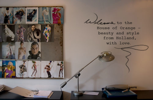
So I thought it might be nice to take you on a little tour of the über stylish office space of the House of Orange. What + who is that you ask? well, it’s the agency that represents me here in Europe (see the little orange circle on the righthand side of my blog?). They are the master keepers of my styling portfolio and the lovely people who book me work! So come with me as I take you on a little wander through this fab place…

pjb_hoo1.jpg

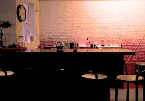
This is the kitchen + bar, where there is always tea upon arrival, and orange lollipops (and at easter there are chocolate easter eggs to snack on). This is also the area where meetings are held between stylists, clients, photographers, and art directors. It’s a pretty cool space.

pjb_hoo8.jpg

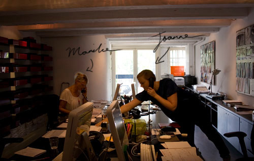
Here in this photo is half of the styling team, Joanne and Marilie. Missing in this photo unfortunately is Erik and new arrival Martin. These four are always flat chat as they represent more than 40 stylists from The Netherlands and beyond – from fashion stylists to hair+makeup, and a sprinkling of interior stylists including stylist and art director Stef Bakker , Bas Andrea, Ulrika Lundgren, and me.

pjb_hoo6.jpg

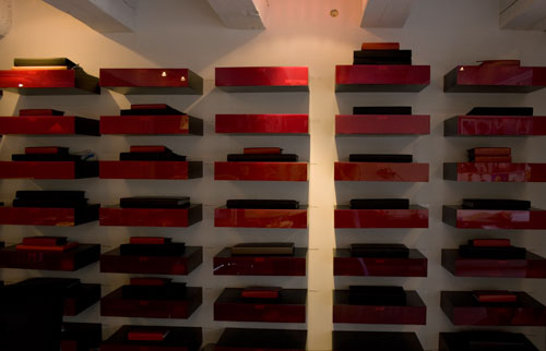
Above you can see all our portfolios. We each have our own shelf with our name and inside the shelf is a little drawer for our mail, magazines and invitations (that’s where I found this gift). If the shelf is empty it means our portfolio has been requested and is out with a client.

pjb_hoo9.jpg

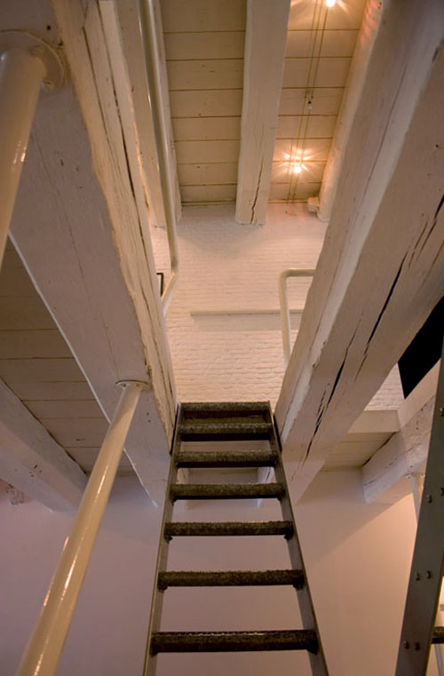
And then up those seemingly intimidating stairs is the photographic department. It’s a whole other world up there! And then there is the modelling part of the agency and then Orange Babies which is the agency’s charity organisation for helping with the prevention and care support for HIV babies and mums in Africa. Orange Babies organises alot of fundraising events within the fashion industry, read more about this wonderful organisation here.

houseoforange1.jpg

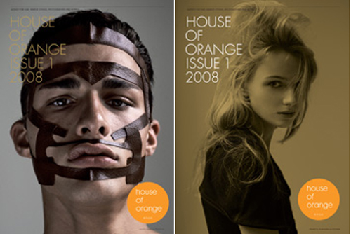
And just recently the House of Orange published it’s first magazine! (as shown above) It’s full of great articles and photos from the talent at the agency so if you’d like to get hold of one just ask. You can read more about the House of Orange by heading over to their website, and have a browse through everyone’s portfolios by clicking on a department and name. Enjoy! I do hope you liked this little tour, and I have no doubt we’ll be back here again soon, for now I just wanted to show you a little bit more of my life in Amsterdam.

harriet’s confession
Posted in interiors, pia's illustrations August 8th, 2008 by piablog

pjb_maria_img_98952.jpg

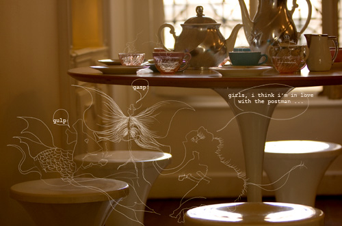
Yep, this is my new passion – drawing little creatures in my photographs and making little stories out of them. I have a feeling you will be seeing more of these in the near future. Have a fabulous weekend!

xx

this has nothing to do with anything
Posted in interiors, pia's photos, the paris apartment August 1st, 2008 by piablog

pjb_bathroomafter.jpg

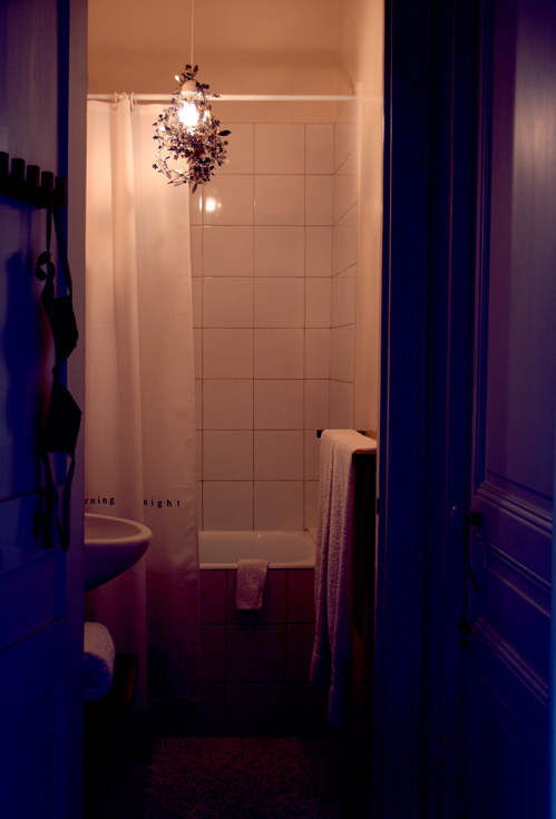
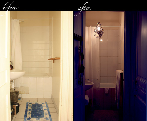
I know it’s not what I said I’d post, but I thought you might like to see the bathroom before and after of the paris abode. It wasn’t included in Grace’s post and I just remembered that you hadn’t seen it yet, so here it is!

pjb_beforeand-after-bathroom1.jpg

A bit of a change, n’est-ce pas?

Since the bathroom was so tiny and there was no natural light, I wanted to play with it’s petite-ness and create a space that was intimate, dramatic and sumptuous (without spending a bundle). So first I scrubbed it from top to bottom to bring back the whiteness as much as possible. I bought a tord boontje garland in black for the ceiling light. The flower shapes from the garland created beautiful shadows all over the antique-cream walls, ceiling, and white tiled floors. I bought two simple white shower curtains – the one with the words for the outside of the bath (to cover that hideous hole!), and a cheaper, plain one to fall into the interior of the bath. I chose accessories from Ikea’s Molger range for the towel rack, door hooks and mirrored cabinet. For a little extra storage I bought a wooden tray with stand that tucked neatly in the left hand corner, and found second hand boxes to hide toiletries. Organic white cotton towels completed the look. And the Elle McPherson bra hanging on the door hook was a beautiful gift from my dear friend michi .

i just feel like posting this photograph…
Posted in interiors, pia's photos, the paris apartment July 25th, 2008 by piablog

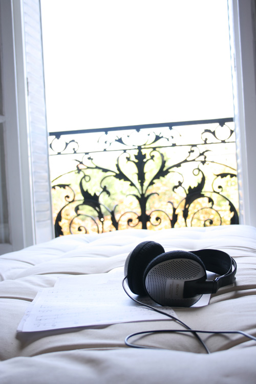
pjb_parisapartment.jpg

my kinda glam
Posted in interiors, trend July 10th, 2008 by piablog

glam.jpg

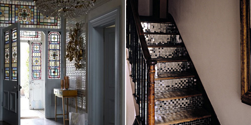
A little morning wander through the blogosphere found me these two images above from this is glamourous and coco + kelly. You know I am not a great fan of opulent rooms and ‘rich’ interiors – my style is more along the earthy, real and livable kind – creating rooms that are actually usable and cosy (you should hear me balk at mtv cribs – it’s apparently humorous to watch me watching this show, I just can’t believe people pretend to live in those places and try to get us, the viewers, to aspire to their pretend lives. nu-uh).

But it’s not like I don’t like shiny things. Because I do – especially like this entrance way and these stairs – I love combining old wood with sparkling things, I find it really brings out the texture and age, and sentimentality of the surroundings.

And that foyer is just cool. I have never been a huge fan of stained glass or shiny wall surfaces (my oma loved opulence – she mirrored her entire hallway and loved a chandelier or ten – and although it did have a ‘wow’ effect, it was more the sort of ‘wow, i suddenly feel a little sick’ effect.) But this entrance way makes me think that maybe one day, I could live with stained glass and reflective walls. Maybe.