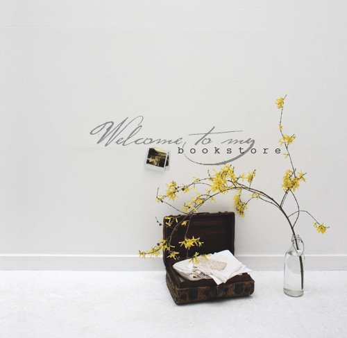
So here is the first post in the series “My Heart Wanders: photographs from the book & design discussions”, as mentioned in my last post to celebrate the opening of my online bookshop.
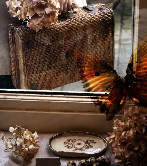
This particular photograph is one of my favourites. It is the chapter opener for Chapter One, Reflection: Leaving Home. For each chapter opener, I wanted to create an image that visually described the story that follows. Each image represents how I was feeling at that point in my life, and what I was doing in my life.
To create this image, I had the idea to create some sort of reflection in a shop glass window. I spent days looking for the perfect window – something with pretty reflections, but also one that I could access from inside with the camera and tripod. As I was living in Amsterdam at the time, I rode my bike around and gazed a thoughtful eye around at all the windows. I lay in bed at night, flicking through all the shop windows catalogued in my mind’s eye each day, and wondered  which would be best. Then it dawned on me – one of my favourite windows and window displays in Amsterdam had always been that of Hilde Tempelman, whose beautiful work and atelier I featured in Amsterdam: Made by Hand. It was perfect! So I called Hilde and asked if she would mind if I come play in her window one morning and as lovely as always, she said “Ja, come on down!”.
So with my little antique rattan suitcase full of props, camera bag slung over my shoulder and tripod attached at the rear of my bicycle, I headed down to Hilde’s studio shop.
I picked a corner of the window and set up my camera and tripod inside the shop. I decorated the window with various props, set my camera on a timer and dashed outside to place myself in frame. It was a bit tricky but after a number of takes, I started to get the right feel and look I was after.
It was a lot of fun to photograph this chapter opener using Hilde’s gorgeous creations as inspiration and props, and it was just as much fun developing the image further in postproduction. I wanted to create a sense of flight so I overlayed the original image with a wing illustration I made using a photograph of bird wings I took some months earlier, making them transparent and then adding a warm colour tone and splashes of ink.
I hope you’ve enjoyed this first look at some of the design elements of My Heart Wanders. The next post will look at how I created the numbers for each chapter opener and what they represent.
+to purchase My Heart Wanders, click here.


