My Heart Wanders: breathers…
Posted in book design, my heart wanders September 23rd, 2012 by pia

It’s been a dazzling, and dare I say balmy weekend here in Sydney. Summer is definitely on the way and I’ve been scrambling through my closet to find some cotton skirts and dresses. And shoes – it appears my swollen pregnant feet last year broke most of them. I heard a good quote the other day in reference to becoming a parent: “each hour has now become 5 minutes”. That is exactly how it feels for me, and then somehow, suddenly, night falls, and I crawl into bed at some unreasonably early hour of the evening. Do you remember the beginning of My Heart Wanders where I describe the jungle path? I’ve since realised that was no jungle path because THIS is the jungle path. This is the rockiest terrain I’ve ever traversed. It’s also the most breathtakingly beautiful terrain I’ve ever laid eyes on.

Anyway, parenthood, it’s a blog post/topic/category unto its own and one I’m not quite ready to write about. Instead let’s talk books! And the design of…

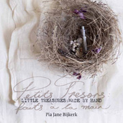
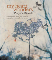
So, I think this will be the last design related post I’ll write for  My Heart Wanders. For this last post about the book design, I flicked through my copy to see what I’d be inspired to write about… there are the sweet page embellishments – tea stains, pressed flowers, water stains and the surprise at the end of the book (that I still would like to keep as a surprise so we can’t talk about that)… and then my eyes rested on these pages you see above and below…

I call these photographs “breathers”. It’s something I incorporate in my client work too: When I photograph something, I like to create a story of images with “breathers” throughout – stop points, images for the eyes and mind to rest, reflect and breathe. These two images I placed at the beginning of the book (just before the prologue) and at the end (just before the epilogue). I took these photographs on a wall of the houseboat.  And serendipitously –  as so often happened while making this book – the light reflections from the water outside the boat windows shifted across my subject. Can you see what I mean? Here they are again…

I could not have wished for something more subtle and beautiful. For me this represented how my story, my journey, was but a moment in time – some time, somewhere. How even though for me it was such an intimate and incredibly intense time in my life, it was a moment in time already passed. And it felt wonderful to have captured it. Bound it. Shared it.

I drew a little sitting butterfly and some leaves with pencil and added these to the photographs. It seemed the thing to do.

I hope you’ve enjoyed this behind-the-scenes look at some of the pages created for My Heart Wanders. Perhaps we can do this again some time?

Enjoy your week ahead mes amis. I’ll be back in the (blog)house very soon.

xx

My Heart Wanders: chapter openers…
Posted in behind the scenes, book design, my heart wanders September 3rd, 2012 by pia

Making the chapter openers was by far one of the most fun parts of making the book. Those of you who have followed the My Heart Wander blog project from the beginning may recall I made whimsical chalkboard numbers using flower petals to mark the countdown toward the photo submission deadline. This became one of the strongest elements of the book from the very start as it was one of the ideas that my publisher loved and was keen for me to recreate as chapter openers.

My “studio” to create these pages was the kitchen floor of the houseboat as it had the most light in the space with its 7 windows looking out over the canal. But it was also the rockiest part of the boat as it was higher than the main living space so I had to pick my days of shooting to be the calmest, and sunniest of all (not easy in a windy, cloudy city!). I set up the tripod and chalkboard and gathered my props on a section of the floor (so you have an idea, the floor was about 3 meters x 1 meter). My props being chalk and lots of flower petals in various states of decay…

so much fun to play with dried petals

For each number I drew a chalk outline on a small square chalkboard, then arranged the flower petals until I was happy with the composition. I would purposely create chalky smudge marks to give the numbers some texture, and was quite loose with each arrangement, stopping when I saw something I liked. Each number was photographed at least half a dozen times with various changes so that I had a few to choose from for the final page.

three in progress…

Sometimes I would get distracted and doodle on the chalkboard, thinking it might look good for something in the book, then I’d step back and realize it was crap, rub it off and get back to work…

playing with petals and chalk

Then once each number was photographed I played around with fonts and chalk scribbles to add the chapter opener text…

When I had something I liked  I’d send it to head designer Vivien at Murdoch Books in Sydney to get her feedback and thoughts on it, we’d play around some more then she would bring it to life by adding her magic touch…

the finished page for chapter 6 of My Heart Wanders

After the chapter numbers were all photographed, I then created images especially for each chapter opening double page spread (DPS). As I mentioned in the previous post, each photograph visually described the story that followed, representing how I was feeling at that point in my life, and what I was doing in my life. Here below you can see the final DPS for Chapter 6…

Tea for me is all about renewing the soul, so creating an afternoon tea setting on my dining room table seemed only fitting for this particular chapter.

………………………………………………………………….

There is one design feature about the chapter openers that I haven’t mentioned, but maybe some of you have already spotted it while reading My Heart Wanders – did you notice the colour way of each chalk & petal number through out the book? Each number graduates in colour, starting from the gentle muted tone of the dried hydrangea petals, moving through to soft pink peonies and dahlia petals, deepening to a richer hue of rose, then purple, then moving onto yellow tones for chapter 6 (the ‘realisation’), and fading off to white for the remaining chapters. This was something very deliberate that I wanted to create, to flow with not only the seasons that the story takes place (starting in autumn in Sydney, moving into Spring when I moved to Paris, then summer, then white for winter in Amsterdam), but also my state of mind at the time of each chapter’s focus. I won’t say much more about it for those who haven’t yet read the book, but perhaps now for those who have, there might be a deeper connection to the story, represented by not just images but the colour and tones within each chapter.

………………………………………………………………….

As you can see, every element, every stage of the making of this book is very much made by hand. From creating each photograph, to making the chalkboard letters, photographing wings and petals and branches to cut and paste onto images. Is there a particular design feature of the book you’d like to learn about?

My Heart Wanders: photographs from the book & design discussions…
Posted in amsterdam, book design, my heart wanders, pia's photos August 21st, 2012 by pia

So here is the first post in the series “My Heart Wanders: photographs from the book & design discussions”, as mentioned in my last post to celebrate the opening of my online bookshop.

This particular photograph is one of my favourites. It is the chapter opener for Chapter One, Reflection: Leaving Home. For each chapter opener, I wanted to create an image that visually described the story that follows. Each image represents how I was feeling at that point in my life, and what I was doing in my life.

To create this image, I had the idea to create some sort of reflection in a shop glass window. I spent days looking for the perfect window – something with pretty reflections, but also one that I could access from inside with the camera and tripod. As I was living in Amsterdam at the time, I rode my bike around and gazed a thoughtful eye around at all the windows. I lay in bed at night, flicking through all the shop windows catalogued in my mind’s eye each day, and wondered  which would be best. Then it dawned on me – one of my favourite windows and window displays in Amsterdam had always been that of Hilde Tempelman, whose beautiful work and atelier I featured in Amsterdam: Made by Hand. It was perfect! So I called Hilde and asked if she would mind if I come play in her window one morning and as lovely as always, she said “Ja, come on down!”.

So with my little antique rattan suitcase full of props, camera bag slung over my shoulder and tripod attached at the rear of my bicycle, I headed down to Hilde’s studio shop.

I picked a corner of the window and set up my camera and tripod inside the shop. I decorated the window with various props, set my camera on a timer and dashed outside to place myself in frame. It was a bit tricky but after a number of takes, I started to get the right feel and look I was after.

It was a lot of fun to photograph this chapter opener using Hilde’s gorgeous creations as inspiration and props, and it was just as much fun developing the image further in postproduction. I wanted to create a sense of flight so I overlayed the original image with a wing illustration I made using a photograph of bird wings I took some months earlier, making them transparent and then adding a warm colour tone and splashes of ink.

I hope you’ve enjoyed this first look at some of the design elements of My Heart Wanders. The next post will look at how I created the numbers for each chapter opener and what they represent.

+to purchase My Heart Wanders, click here.