Do you remember some time ago now, I wrote about an architecture & design firm called tacklebox? It is an innovative company based in New York, founded by my friend & architect Jeremy Barbour. If you recall, he designed the saipua showroom in Brooklyn, NY, creating a fabulous space made from recycled silver barn wood (read my post and view the gorgeous photos of the space here).
Last year, Jeremy came out to Australia for a special secretive research mission for melbourne-based skin care range aesop, and over a lovely lunch in Paddington, here in Sydney, he revealed to me a little about what he was up to and what he wanted to create. I was captivated, and could not wait to see the project unfold and revealed to the public. A few months ago, the spaces in New York were opened: one in grand central station, another on Elizabeth St in the Nolita, and the other in Greenwich Village, University Place. Take a look…
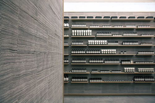

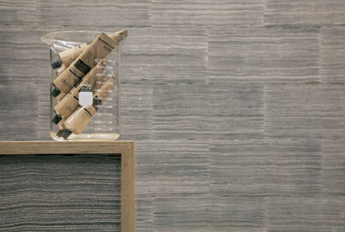
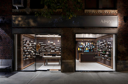
Aesop Nolita, Elizabeth St, New York, photos by Gianluca Fellini.
………………………………………………….
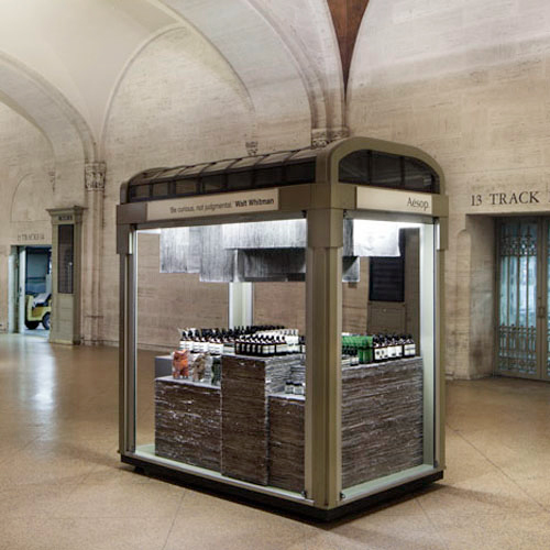
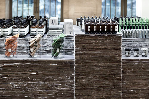
Aesop Grand Central Kiosk, in Grand Central station, photos by Juliana Sohn.
………………………………………………….
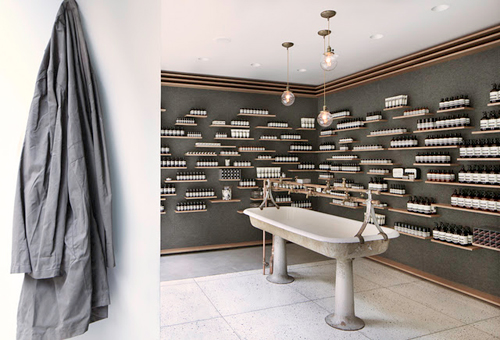
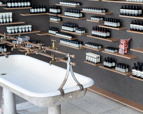
Aesop University Place, Greenwich Village, photos by Juliana Sohn. (particularly loving the store’s sink which was salvaged from Bethlehem Steel’s 140-year-old plant in Pennsylvania).
………………………………………………….
The concept was to use the New York Times newsprint as a material within the foundations. The aesop Grand Central Kiosk for example, is constructed of 1,800 reclaimed newspapers from the New York Times. The aesop range sit on a tiered mass of stacked and bound newsprint while loosely hanging papers form a canopy above. For the Nolita store, 2800 New York Times newspapers were hand-torn into 400,000 strips which were then stacked to create “a soft, felt-like surface held within a continuous oak wrapper”.
“Just as oak is commonly used to store and age wine and spirits, so too will the newspaper age, turning a light tan, thus marking the passing of time. In this way, the history of Aesop North America will be recorded within the very walls of this first store.”
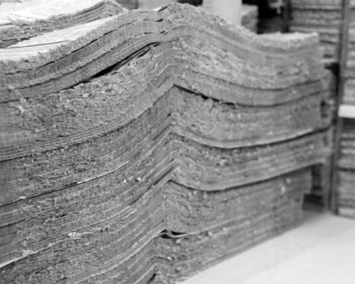 The newsprint, stacked and pressed, ready to be used.
As you know, I’ve been loving the use of recycled paper as a material lately, perhaps it has something to do with the onslaught of technology, and the growing, ill feeling of living within a paperless society. Preserving and maintaining the use of paper in our world seems imperative, and I love how imaginative people are toward its many uses these days.
Congratulations Jeremy on completing yet another stunning set of spaces using recycled material and furnishings – you’re an inspiration to us all, I can’t wait to see what you create next! And a big thank you for sharing your projects here in the (blog)house.


 All photographs and words in this guest post by Ashley & Aron Bruhn of
 beautiful nyc photography by

 All photographs and words in this guest post by Ashley & Aron Bruhn of