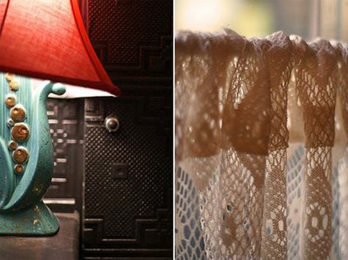
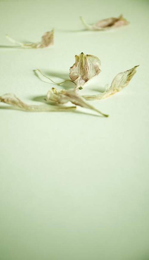
mother (earth) is calling…
Posted in nature March 28th, 2008 by piablog

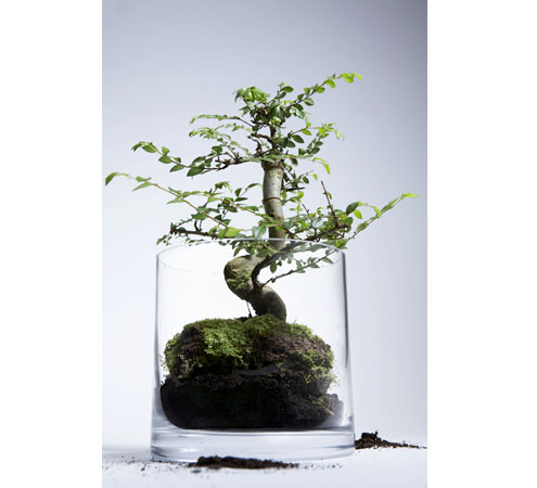
bonsai-shop.jpg

one hour. wherever you are in the world. this very saturday – march 29. at 8pm. sans lights. i’m up for the challenge!

Photograph by David Finato. Art Direction and Styling by Pia.

Suggestions for (earth) hour-long games to play in the dark are in the comments…

a few of my favourite things around the house…
Posted in stylists own March 28th, 2008 by piablog

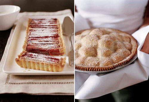
pies1.jpg
this pie shoot I styled with incredible food editor Emma Knowles and photographed by Petrina Tinslay

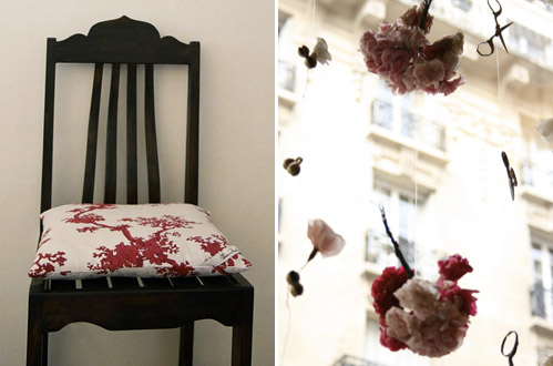
pia-props.jpg
This Moroccan chair from my old store, and my Signature Prints cushion. And this window display I shot in Paris.

cookies1.jpg
oh yes! I should bake some this weekend.

img_2468.JPG
this peacock feather that comes in handy for adding a dash of vibrancy to a little vignette. and my old old books.

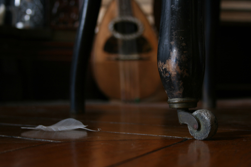
img_25531.jpg
the wheels on Napolean(‘s) chair, a skeleton leaf and my ancient Mandolin.

oh yes
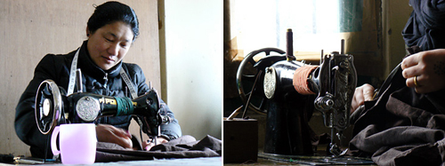
Posted in handmade, tibet March 27th, 2008 by piablog

tibetan-womens-association.jpg

this is awesome.

around the neighbourhood
Posted in photographers March 27th, 2008 by piablog

anna1.jpg

I’ve been wandering again. But without a boss over my shoulder telling me to stop, I can’t help it! And anyway, is it that bad that I do? I mean, it’s all research right? Right?

anne-klyttenaar.jpg

dsc06646_2_1.jpg

These incredible images are from photographer Anne Kluytenaar who stopped my minds chattering when I laid eyes on her work over at Montmarte’s Sketchbook. Renee, you totally caught my heart when you posted Anne’s work, thank you! Click here to link to Anne’s flickr set.

aloneonsaturdaymorning.jpg

Then I wandered over to Ali’s to see what she was up to and to my delight, she has been dedicating this entire week to Amelie! A must see as Ali has rounded up some awesome treasures inspired by this beautiful film, including gnomes, red converse, an instamatic camera, beautiful Amelie-like garments and she even spotted some amelie in the everyday within her own flickr set as seen above! And on top of that, she found some beautiful stranger playing the theme song to the film on piano, on you tube – the perfect soundtrack for this week’s Ali + Curtis treat. LOVE this idea Ali, so inspiring.

Another must read:

For those of you who know you would love to work in the design industry but are unable to find your feet, Holly at Decor 8 is starting a series of posts on how to find your calling in the design world. She mentions the importance of carrying an ” umbrella (ella ella) with you as you travel down your newfound path”. I have no doubt there will be great tips. I have a rather thick umbrella myself, with loads of layers, nothing can puncture that sucker now!

258421209o172895261.jpg

and I just love this image from nataJane.

Okay back to work. Um. But first I should pour myself a cup of tea. And perhaps I should just check these emails in case they need urgent replies. And hang on, I haven’t checked…

reader request
Posted in photographers March 26th, 2008 by piablog

Could this be my first official reader request? Very exciting.

Jennifer is an interior designer and writer from Detroit, and she also writes a blog called Design Hole which is rich with design-loving booty and heaps of interior design tips. She recently emailed me asking if I had some pointers for taking interior photographs, and suggested that this might be a topic fellow bloggers would enjoy since you write blogs too which require nice interior photos! So let’s give it a go…
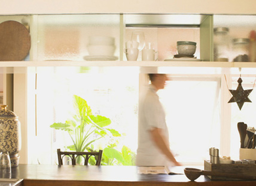
lg-interiors-8.jpg

I just happened to be working with my (blog)house guest, photographer David Finato the other day, so I thought I’d pose the question to him. While we were indulging in gooey stroopwafels and hot chocolates during our morning tea break, he shared these tips with me for Jennifer…
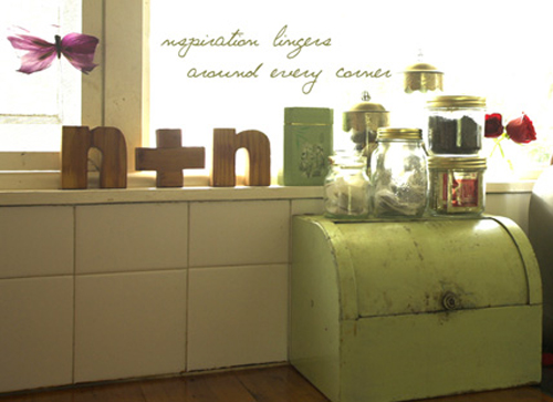
lg-interiors-2.jpg

“Use natural light and a tripod.”

Brilliant and simple, and I couldn’t agree more. The two biggest photo faux pas are those taken with overhead lighting and flash, and those that are not still and clear from camera shake. If you don’t have a tripod handy, then find a level surface to set your camera on. Added with just using available light and you should see a tremendous difference with your images.
baby1.jpg

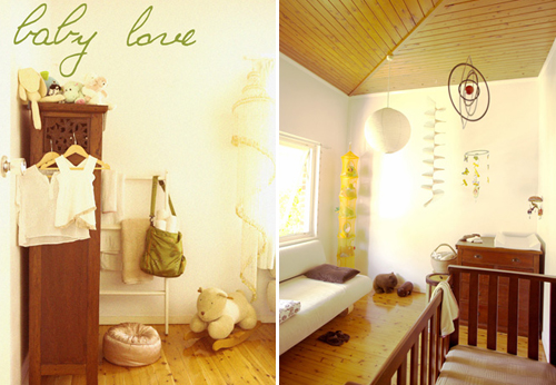
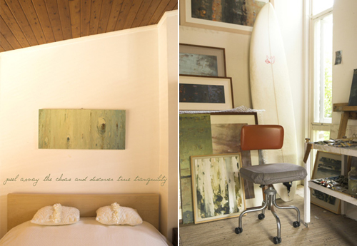
From a stylists view, I would add ‘look at the detail’ when you look through the lense. It is practice practice practice as your eye will get more attune to tiny details. As an exercise, simply try to colour co-ordinate at first – if you see a colour stand out in the space as you look through the lense add more of it with similar tinted homewares. Try this and see what happens!
room.jpg

Earthy tones of brown and green stood out the most in this house so I brought it out as much as possible by pulling out homewares that complimented these tones, adding little dots of other colours and unique pieces to bring a little subtle zing into each image.

Let me know how you go and I’d love to see your results. Try a little ‘before and after’ and see the difference! These are great tips for My Heart Wanders too. And if you have a reader request of your own, be sure to leave it in a comment below, or email me. Thanks Jennifer!

Photography by Michael Wee, styling by Pia.